Turn the sample before choosing
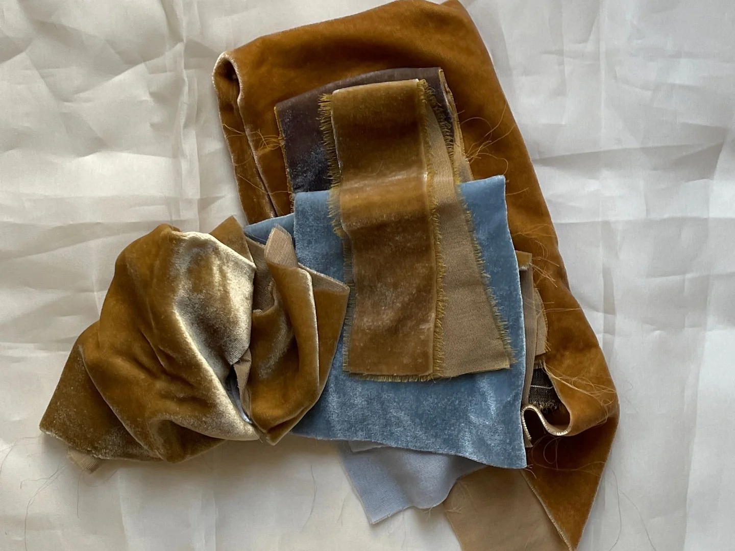
A velvet-like swatch can look rich and dark in one direction, then noticeably lighter when turned. That variation is part of the surface you are considering, not necessarily a different dye colour. Move the sample around before deciding which appearance represents the fabric.
Hold it upright for curtains or a headboard and horizontally for a seat. Form a loose fold and look at the bright and shaded sides. A flat square under a shop light cannot show every way the finished textile will be seen.
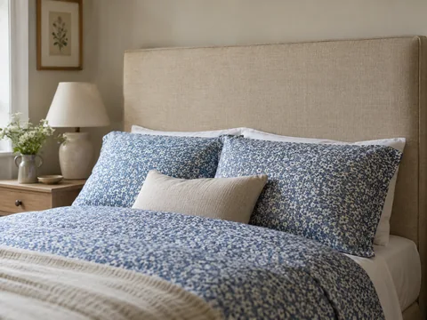
Compare it in the intended room beside the largest neighbouring material. A cushion sample belongs next to the sofa, a curtain sample beside the wall and a headboard sample near the bedding. Keep the fabric's intended direction in mind; patterned or piled textiles may have a specified orientation that should be followed when made up.
Look from more than one normal viewpoint. A sofa can be approached from the door and seen from a chair opposite. If the fabric changes strongly between those views, decide whether you enjoy that effect. There is no need to make the material appear identical from every angle, but a change you dislike will remain part of daily use.
Include the evening lamps. Side light can emphasise texture and pile, while a more even light makes the colour look quieter. Avoid choosing solely from the brightest possible condition if the room is normally softer and darker.
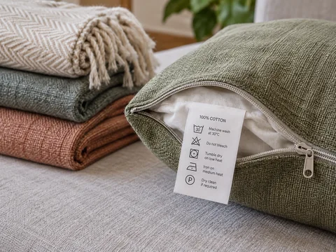
A sample also gives you a chance to check feel and weave, but treat it respectfully. Do not perform improvised stain or cleaning tests unless the supplier specifically provides a testing sample and instructions. Follow the actual product's care guidance rather than assuming a successful experiment on a cutting establishes a safe method.
Before ordering, record the fabric code and colourway, not just a photograph. Camera processing and screen settings can change the remembered shade. The physical sample, seen in the directions and light that matter, is the better reference for the finished choice.