Find the white you cannot change
The awkward moment usually comes after installation: the new cupboard looks crisp, the wall looks creamy and the window frame suddenly seems blue. None of the surfaces has changed. Their proximity has made the differences easier to see.
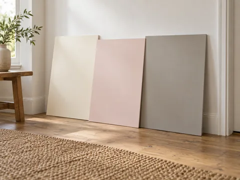
Begin with the largest white object that is staying. It might be a kitchen door, a bathroom tile or a fitted wardrobe. Bring paint samples to that object instead of choosing them against a white shop display. If several fixed whites already differ, decide which relationship is most visible. A wall touching a cupboard for three metres deserves more attention than a distant door in another room.
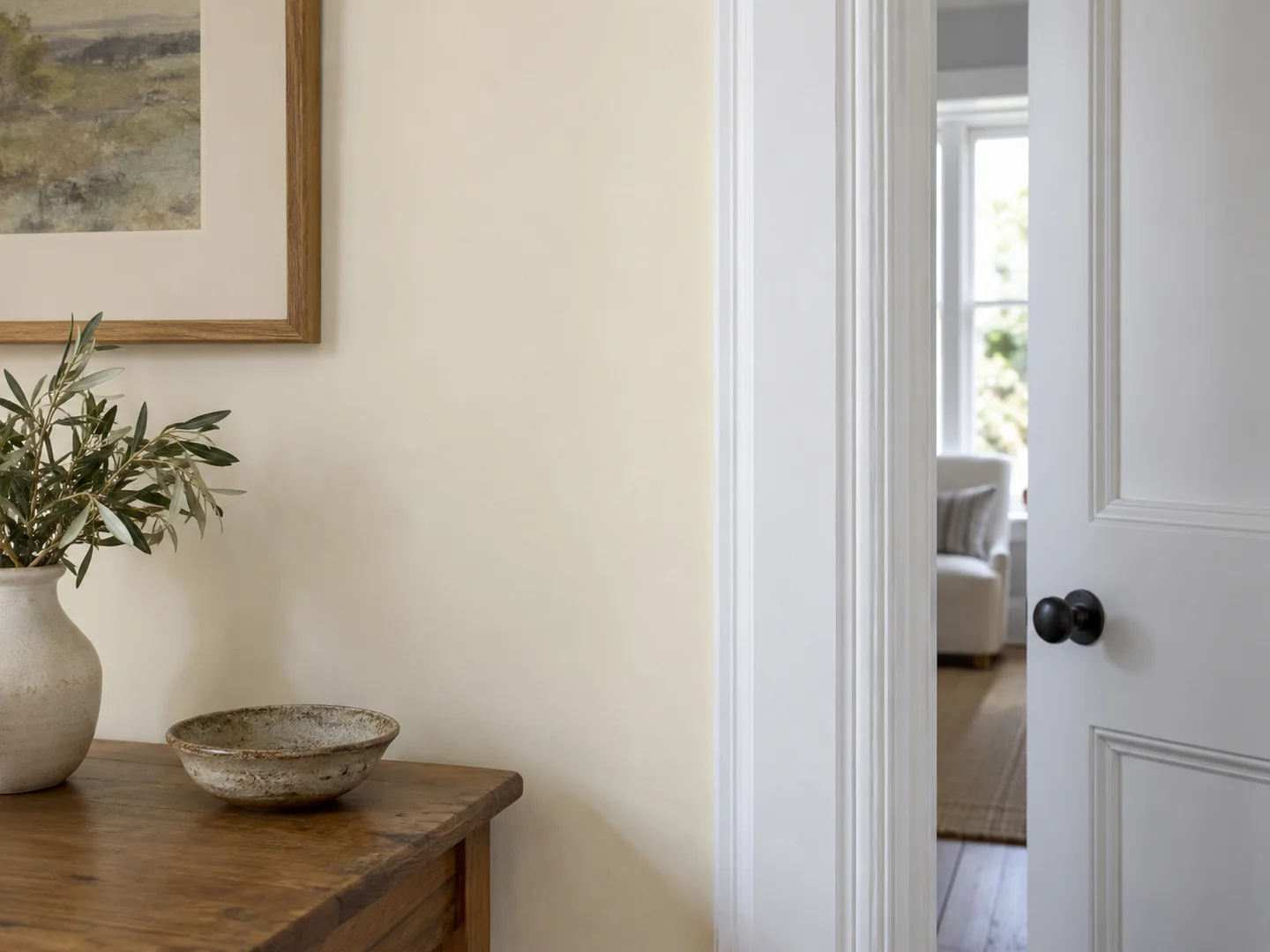
There are two workable approaches. You can search for a close visual match, accepting that different materials and finishes rarely look identical in every light. Or you can make the difference deliberate by choosing a noticeably warmer or deeper wall colour. The uncomfortable result is often an almost-match that looks accidental.
Compare colour and surface separately
A glossy frame catches highlights while a matt wall spreads them more softly. Hold the samples at similar angles and look away from the brightest reflection before deciding that one is the wrong colour. Move back as well: the room is normally seen as a whole, not inspected with two surfaces a few centimetres from your nose.
For example, a clear-white wardrobe beside a pinkish off-white wall may create a quiet contrast you like. Adding a yellowish cream curtain introduces a third pale note. Before replacing the paint, test a curtain sample nearer to either the wall or the wardrobe. The smallest change may be enough to make the group feel considered.
Avoid assuming that every product carrying the same colour name will match. Paint ranges, factory finishes and fabric dyes use their own specifications. Order physical samples where they are available and compare the actual combination.
Allow a little difference
A home does not need one universal white. Doors seen along the same hallway usually benefit from consistency, but a linen lampshade, ceramic basin and painted ceiling can each have their own character. The aim is to remove a distracting clash rather than erase all variation.
Make the final comparison under the lighting used most often. A bathroom judged under daylight alone may look quite different beneath the mirror light. If the whites are comfortable together there, stop looking for a perfect label match. You are choosing the appearance of a room, not proving that several materials have the same name.