Give the sample its intended position
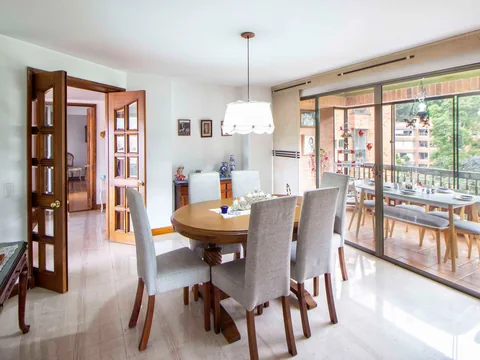
Lay a curtain sample vertically near the window instead of judging it flat on a table. Put upholstery fabric over the sofa or chair where it will be used. Position affects how the light reaches the weave, pile and folds, so a convenient flat comparison is only part of the story.
Keep the existing materials beside it. A beige sample that seems neutral alone may read pink against an olive sofa or rather grey beside warm timber. The issue is not whether a colour name is accurate; it is how that material appears among the things staying in the room.
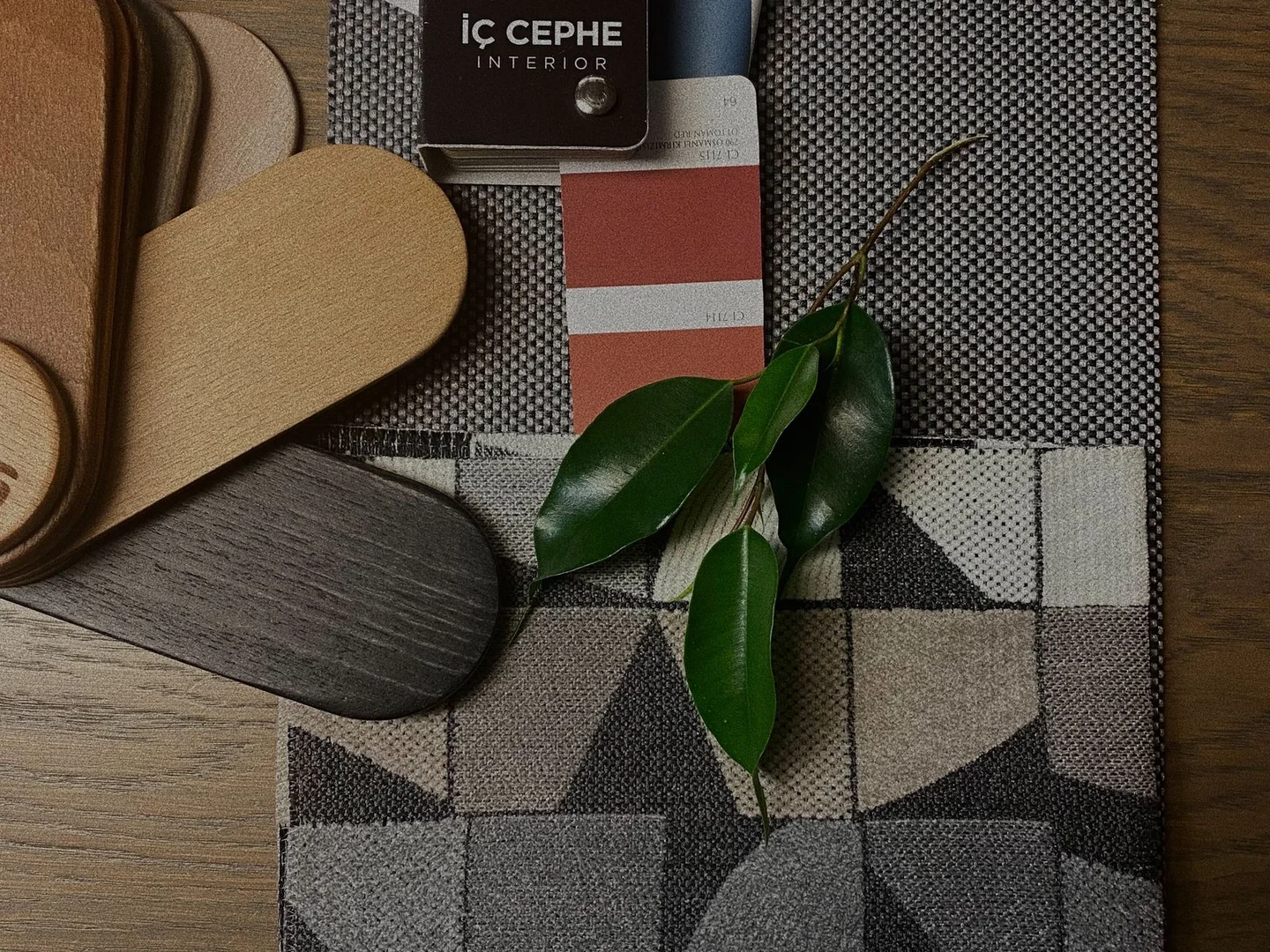
Use samples large enough to see the texture and, where relevant, a meaningful part of the pattern. A tiny cutting can show the yarn colours while giving little sense of how they combine across a cushion or curtain. Ask the supplier what sample sizes are available before assuming the smallest one will answer every question.
Return after the daylight fades
Switch on the lamps you normally use in the evening. Look at the sample from the doorway and from the seating area. Check the shadowed folds as well as the brightest patch. A fabric with a slight sheen may catch a concentrated lamp very differently from a matt weave.
If you are also changing the lamps, settle on a likely bulb and shade combination before ordering a large quantity of fabric. Otherwise the two decisions keep moving underneath each other. There is little value in rejecting a fabric because it looks wrong under a temporary lamp you already intend to replace.
Compare one or two finalists rather than a dozen samples scattered around the room. A crowded selection creates its own colour relationships. Remove the rejected options so you can see how the remaining fabric works with the actual furniture and walls.
Use photographs as notes
A photograph is useful for recording where you placed the sample and which combination you tried. It is less reliable as the final judge of colour. Automatic white balance, screen settings and the viewing device can all change the impression. Whenever possible, make the decision from the physical samples in the room.
Check care instructions, width and intended use separately from appearance. A fabric that looks ideal beneath a lamp may not be suitable for the upholstery job or washing routine you have in mind. Keep those specifications with the sample so the visual favourite does not quietly become an impractical choice.
You do not need the fabric to look identical at noon and at night. Some change is part of living with natural and artificial light. What matters is that you like its range of appearances, including the one you will see on an ordinary winter evening.