Look up from where you use the room
Ceilings are often chosen by default. White goes on the shopping list before the wall colour has been settled, and the largest uninterrupted surface in the room becomes an afterthought. In a bedroom, where you spend time looking upwards, a separate ceiling colour can be a meaningful part of the scheme.
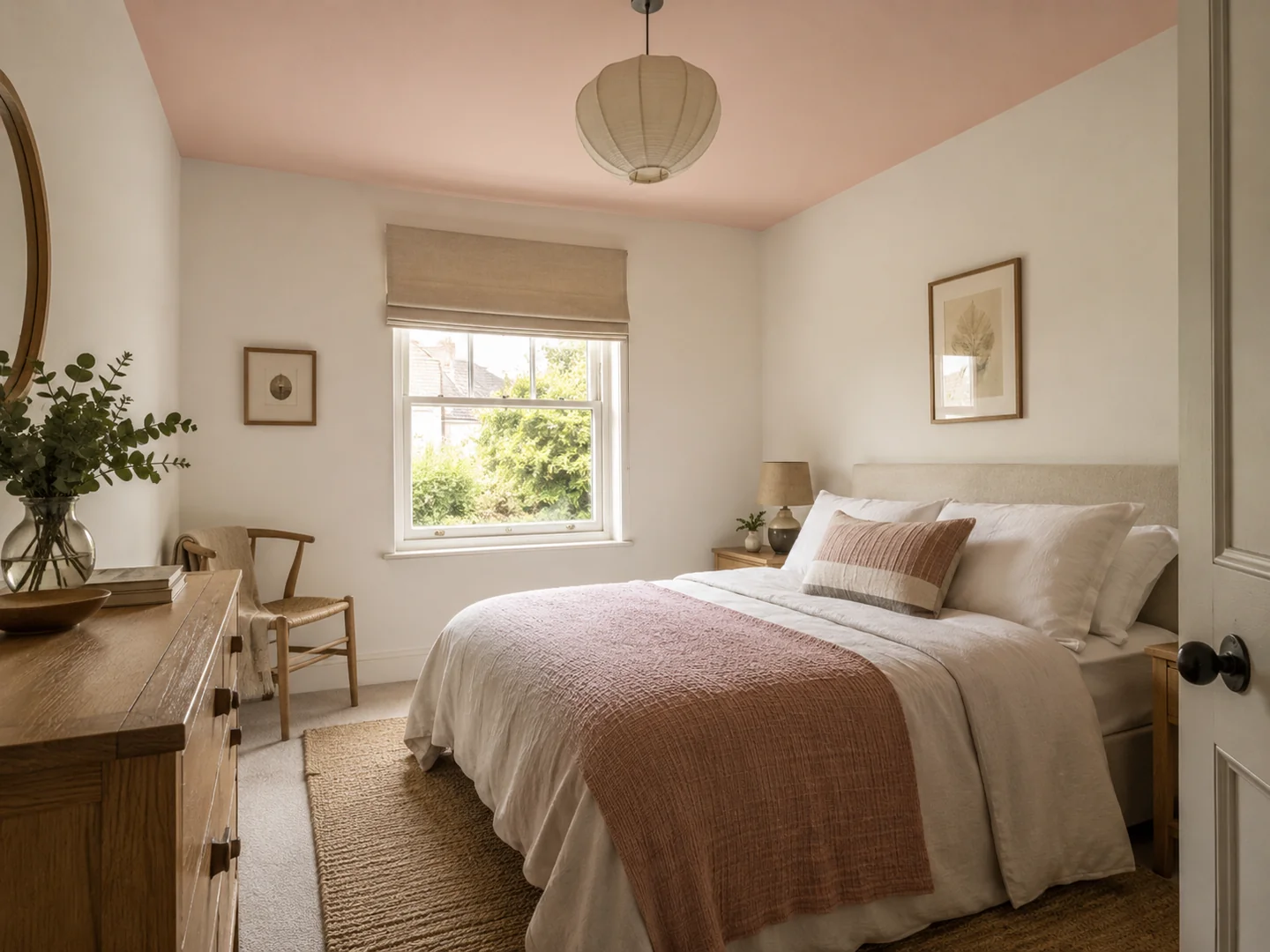
Begin from the bed or the chair rather than only standing in the doorway. Notice how much ceiling you see and what interrupts it: a pendant, a ceiling rose, beams or a sloping roof. A pale blush ceiling above warm white walls makes a different proposition from painting the whole roof structure in a deep tone. Both are possible, but they solve different visual problems.
There is no reliable rule that every coloured ceiling makes a room feel lower. The strength of contrast at the top of the wall, the light and the room's proportions all affect your impression. Instead of making a decision from that slogan, sketch the actual boundaries you are considering.
Decide where the colour ends
With a cornice, you have at least three surfaces: wall, moulding and flat ceiling. A white cornice can create a frame around a coloured ceiling. Taking the ceiling colour over the moulding makes the division less pronounced. Painting cornice and wall together leaves the flat ceiling as its own plane. Choose deliberately so the decorator is not left to infer the boundary.
In a room without a moulding, inspect the wall-to-ceiling junction. A strong contrast draws attention to that line. If the plaster is uneven, a subtle colour difference may be more forgiving visually, although paint colour cannot repair a damaged surface. Any preparation should suit the existing materials and the chosen paint system.
For sloping ceilings, trace the proposed colour with a simple room sketch. Stopping at an arbitrary height can cut the roof shape into separate pieces. Following the planes may feel more coherent, but consider what happens when a slope runs directly into a low wall behind furniture.
Try the colour horizontally
A wall sample does not fully show a ceiling colour. Hold or safely support a painted board horizontally so you can see it in the ceiling's light; do not balance heavy boards overhead. A smaller handheld comparison is better than a hazardous arrangement. View it beside the chosen wall sample, and remember that a large finished surface will have more presence than the board.
Test with the room's normal lights on. Some fittings send much of their light upwards, while shaded lamps may leave the ceiling relatively quiet. The same pale colour can look stronger around a bright fitting and almost disappear in a dim corner. This variation is part of the finished scheme.
If you plan to replace a pendant, decide that at the same time. A dark shade can become a strong silhouette against a pale ceiling; a coloured shade may clash with a colour that seemed subtle on its own. Check the ceiling rose as well, since it can form a conspicuous white island if everything around it changes.
Keep the rest of the room in proportion
A coloured ceiling does not require a matching cushion, rug and vase. You might use the colour once more in a small detail, or leave it as the room's only pink, green or blue surface. What matters is the relationship with the larger materials already present.
Before committing, look into the room from the landing or hall. The ceiling may be the first colour seen above the doorway, even when most of the walls are hidden. If that view works and the room feels comfortable from its usual seating position, the colour has passed a more useful test than whether it follows a particular trend.