Give one side more space
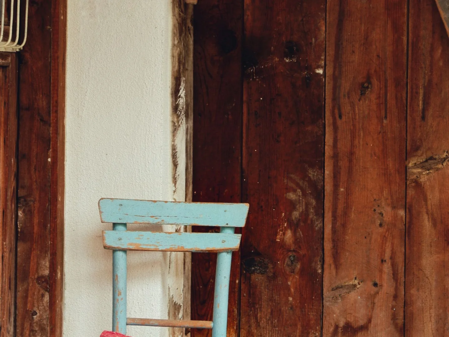
A rust chair against a pale blue wall is an easy example of warm and cool colours working together. The wall has more area; the chair provides a concentrated contrast. Problems often begin when every colour is given equal size and strength, leaving the eye unsure where to rest.
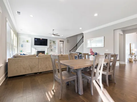
Choose the large surfaces first. If the walls, rug and sofa are cool-toned, a warm timber table and a smaller clay-coloured textile may be enough. If the room is already full of honey oak and cream, a muted blue curtain could bring a different note without repainting everything.
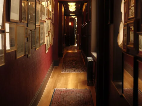
You do not need to calculate a decorative percentage. Simply photograph the room from the doorway and notice which colours occupy most of the image. Use the photograph to understand proportions, then return to physical samples to judge the actual shades.
Compare strength as well as temperature
A very bright orange and a pale misty blue have different levels of intensity as well as different temperatures. The orange may dominate even when used on a small object. A softer rust may sit more comfortably with that same blue because both have a quieter character.
Try the contrast in movable items first when the larger room is already furnished. Borrow a throw from another room, put a piece of coloured paper behind a shelf or place a fabric sample on the chair. The aim is to see whether you want more warmth, more coolness or simply more difference between adjacent objects.
Watch the neutrals in between. A cream rug and a white lampshade can act as pauses, but their own undertones are still visible. If the combination looks muddled, removing one nearly matching neutral may do more than introducing a fourth accent colour.
Let materials do some of the work
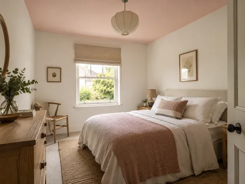
Timber, stone and metals already contribute colour. A walnut cabinet can provide the warm element in a blue room without another orange cushion. A grey stone hearth can supply a cool note beside a pinkish wall. Treat these as part of the composition rather than assuming only painted and upholstered surfaces count.
Check the arrangement with the lamps on. A room that seems balanced in daylight may look much warmer in the evening. That change may be welcome, especially in a sitting room, but it should be a choice you have seen. A mixed palette succeeds when the actual combinations feel comfortable together, not when each item has been assigned to the correct side of a colour wheel.