The room is more than its compass direction
A north-facing sitting room is not automatically a dark room. A broad window overlooking open sky can admit considerably more daylight than a smaller window facing a nearby wall. In the UK, north-facing light tends to be cooler and receives less direct sun, but the window size, surrounding buildings and time you use the room still deserve a look before you choose paint.
Take a plain sheet of white paper around the room on an ordinary day. Beside the window it may look quite different from the same sheet near a deep alcove. This is a useful reminder that one paint colour will not have a single appearance across every wall. You are choosing a range of appearances that you can live with, not trying to hold a colour chip perfectly still.
Write down what cannot change: perhaps a grey sofa, honey-coloured floor, cream fireplace and dark television. Those large surfaces already form a palette. A new wall colour needs to sit beside them more often than it needs to resemble an attractive photograph on a phone.
Choose between a lighter room and a more enclosed one
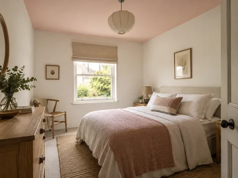
If you want the room to feel pale, try a small group of warm off-whites rather than buying the brightest white immediately. Compare an ivory, a pinkish stone and a soft yellow-based neutral. They will not all suit the floor or the sofa. A creamy colour that looks gentle beside oak may look surprisingly yellow against an existing cool-white window frame.
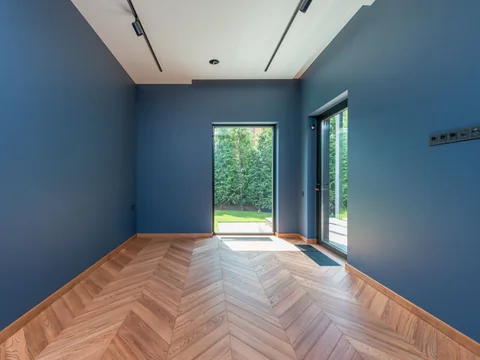
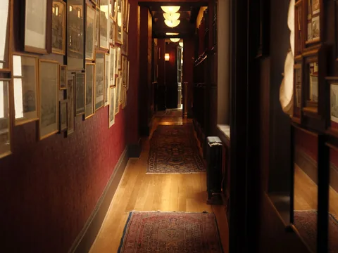
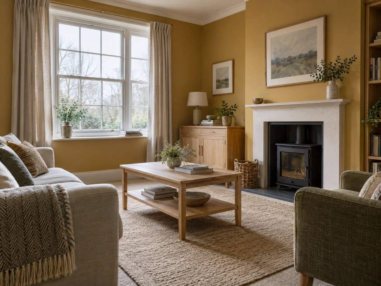
You can also choose a deeper colour deliberately. Muted ochre, clay or olive may give an evening sitting room the enclosed feeling you want. That choice should be accompanied by usable lighting and some visible contrast: a lighter lampshade, pale upholstery or artwork with a generous mount. Painting the walls dark does not solve poor visibility, and adding scattered bright cushions does not replace a reading light.
A middle shade can be a useful third option. A softly coloured wall may look more intentional than an off-white that repeatedly reads as dirty beside the ceiling. Put the alternatives on separate sample boards so that you can compare them against the real room instead of painting a distracting checkerboard on one wall.
Make the evening decision in the evening
Stand each sample upright at sofa height, next to the floor and beside the fireplace. Leave it in a shadowed corner as well as the brightest part of the room. Then repeat the exercise with the lights you normally use. Little Greene recommends considering both daylight and artificial light when sampling; this matters especially if the room is mainly occupied after work.
Do not change all the bulbs just to make a sample look better unless a lighting change is part of the actual plan. If one colour is pleasant only under a lamp you rarely switch on, it has not really passed the test. Equally, a shade need not look identical in every condition. The question is whether you enjoy the changes and can still see comfortably when reading, talking or watching television.
Before ordering, hold the chosen sample beside the proposed woodwork and ceiling colours. A gentle off-white ceiling can soften the division above a mid-toned wall; a clearer white creates a stronger edge. Neither choice belongs exclusively to north-facing rooms. Keep the decision tied to this particular room and its daylight, and the compass direction becomes useful information rather than a decorating instruction.