Start with the longest view
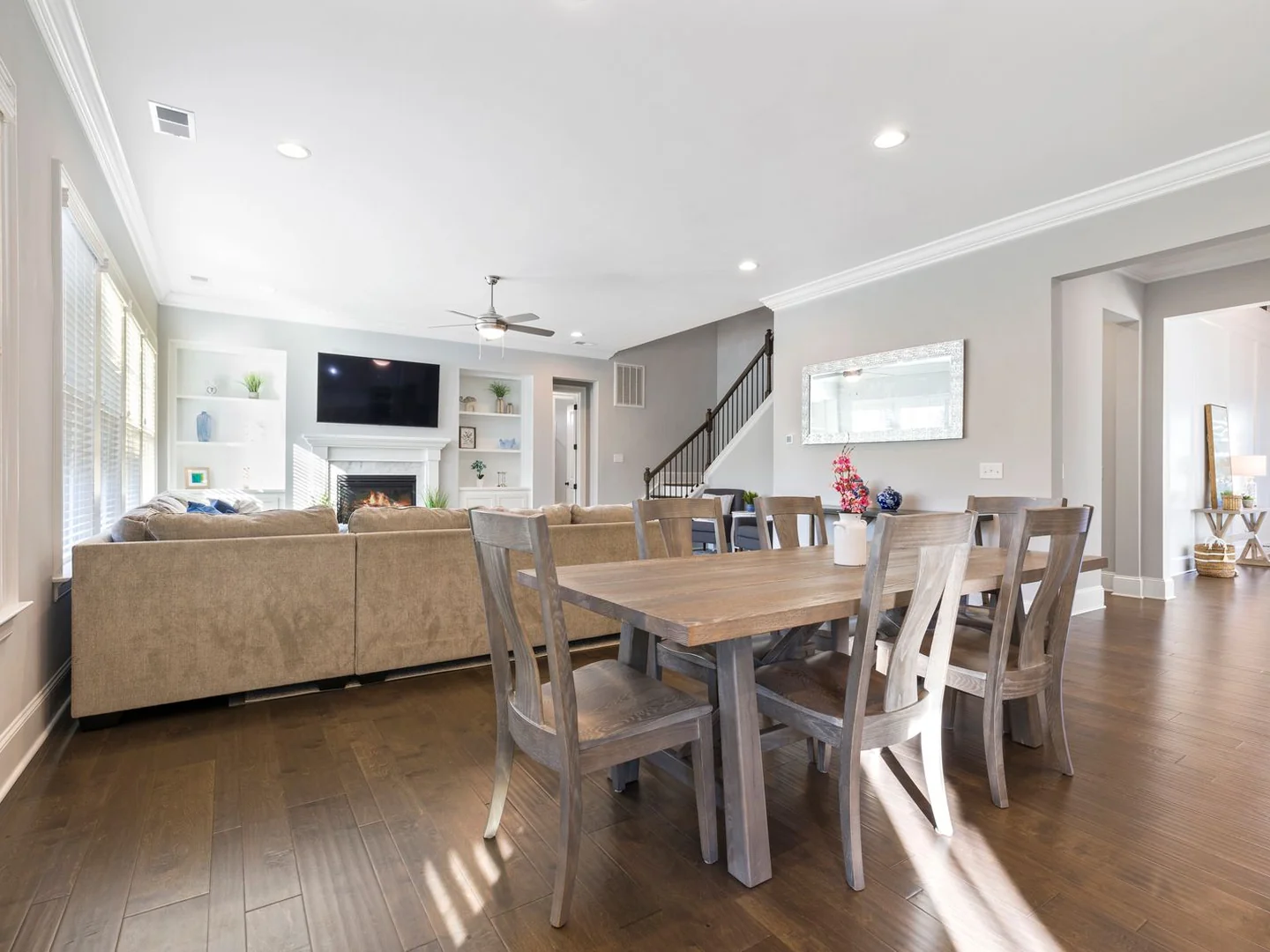
In an open-plan room, colour is rarely seen one wall at a time. The kitchen cupboards sit behind the dining table, the sofa is visible from the sink and a curtain may run across both areas. Walk the length of the room before choosing a separate palette for each activity.
Note the fixed finishes first. Kitchen doors, flooring and a fireplace are usually harder to change than cushions. If the room has a grey kitchen, oak floor and a cream sofa, those three materials already connect the space. An additional colour should work alongside the group, not just beside the sofa in a cropped photograph.
Choose a view that includes most of the room and use it as your main comparison point. This does not mean every corner must look identical. It means that a new wall, rug or curtain colour will be judged in the company it actually keeps.
Repeat a colour in different forms
Olive dining chairs and a little olive in a living-room textile can create a connection without buying a matching furniture set. The colours need not be exact twins. Related shades in different textures often look more settled than identical accessories distributed at regular intervals.
Scale matters. Six strongly coloured chairs have a larger presence than one cushion, so the sitting area may need only a small echo. If the sofa itself is coloured, you could reverse the arrangement and let the dining side carry a quieter reference in a print or table runner.
Avoid insisting that every zone contains every colour. That tends to create a shopping list rather than a room. One area can be mostly timber and cream, another can contain a deeper wall, provided the transition makes sense from the shared viewpoints.
Place a change where the room gives you an edge
A chimney breast, return wall or change of ceiling plane can provide a natural place to stop a paint colour. A line halfway across a flat wall is more conspicuous and needs a reason. If the only reason is that the dining table currently sits there, consider whether the table might move later.
You can define the sitting area with a rug or the dining area with furniture shape instead of a second wall colour. Open-plan rooms already contain many objects and functions. Keeping some surfaces continuous can make those differences easier to read.
If you do use two wall colours, compare them on adjacent sample boards and then separate them by the actual distance in the room. Colours that look appealing side by side on a table may have very different weight when one fills a large wall and the other appears only above kitchen units.
Check the lights as a group
The kitchen, dining and sitting areas may have different fittings, and those lights can change how the same paint appears. View the samples with the combinations you really use: cooking lights only, dining pendant on, and the quieter evening arrangement. A colour does not have to stay visually constant, but a sudden unwanted cast is worth discovering before painting.
Curtains are another connecting surface. One continuous fabric across a broad window can help the whole room settle, even if the furniture is varied. If separate window treatments are needed, compare their texture and colour from across the room rather than treating each window as an isolated purchase.
Finally, put ordinary objects back into the picture. A fruit bowl, books and coats already add colour. Leave room for those things instead of filling every gap with a planned accent. A palette has done its job when the kitchen and sitting area feel related during a normal evening, not only when the worktops are empty.