Choose the pink beside the timber
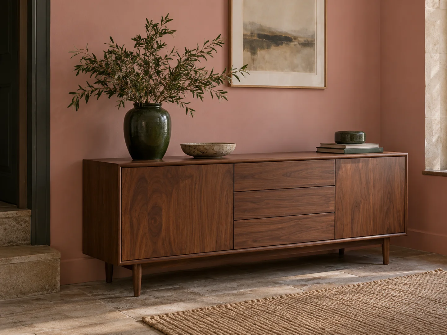
Pink is a broad family of colours, from chalky beige-pink to bright coral. If a walnut cabinet or timber floor is staying, use it as the first comparison. The wood's warmth may make one pink look soft and another look unexpectedly orange.
Put a large sample behind the furniture rather than balancing a tiny chip on top. The finished wall will surround the piece, and that larger relationship is what you need to see. Try a quieter, greyer alternative as well as the colour that first attracted you.
There is no need to make the room prove that pink is sophisticated. Start with a shade you enjoy and give the existing materials a say. The result can be plain, colourful, formal or relaxed depending on the furniture and scale of contrast.
Use darker objects as real shapes
A deep green vase, charcoal chair or dark wood table can provide a clear edge against pink. Choose objects that have a purpose or a place in the room rather than adding dark accents solely to balance a colour formula.
Stone and ceramic surfaces introduce another kind of variation. A pale mottled hearth or a simple cream lamp can sit between the wall and darker furniture. Check their undertones together: a very yellow cream may shift the whole arrangement warmer than intended.
Textiles can remain simple while you judge the walls. Ivory curtains and a plain rug give the pink room to be seen. If you want pattern, try a design with a different scale from the furniture's texture, and avoid assuming it must contain the exact wall colour.
Look at the room after sunset
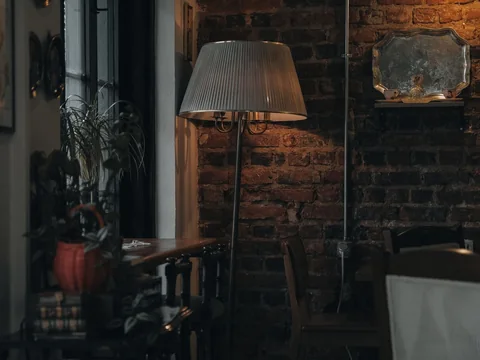
Some pinks become noticeably warmer under evening lamps. That may be appealing in a sitting room, but test it before painting a large area. If the sample becomes too peachy for your taste, try a version with less yellow warmth rather than trying to correct the whole room with cool accessories.
The ceiling and woodwork define the boundary. Bright white creates a clear contrast; a related off-white makes the transition softer. Test both against the actual sample instead of choosing a standard white automatically.
A pink wall is enough to establish the colour. Leave space for ordinary books, plants and furniture without requiring them all to follow its palette. That makes the room easier to use and to change later.