Choose the area before the shade
Terracotta can mean a pale clay, a dusty pink-brown or a strong burnt orange. Before selecting a sample, decide how much of the room will carry it. A colour you enjoy on a pot can feel very different across four walls.
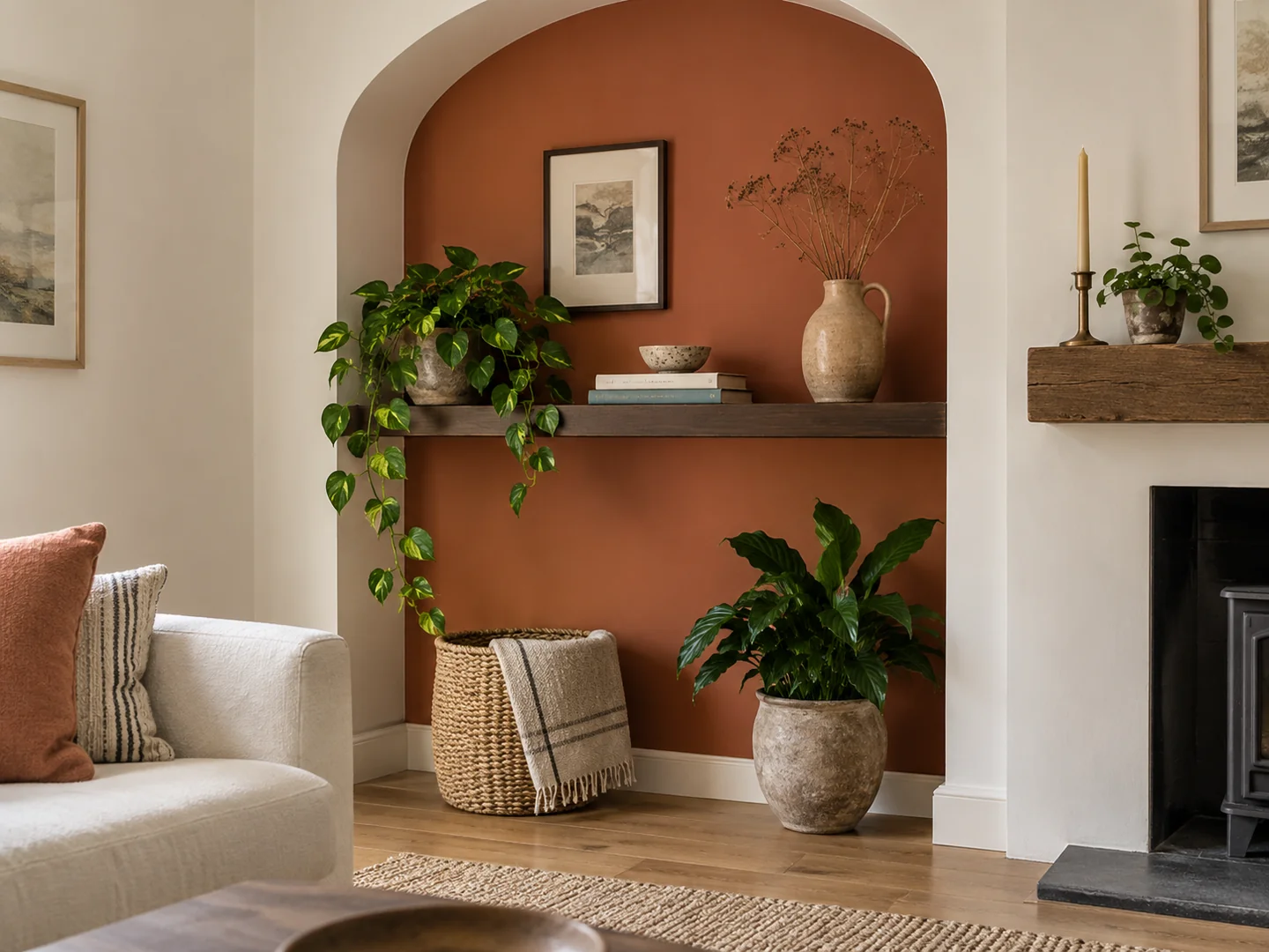
An alcove, the back of an open shelf or one substantial textile allows you to try the warmth on a contained surface. A whole wall gives the colour more authority. Neither needs a matching collection of ornaments to explain the choice.
In a room with orange-toned timber, test the paint directly against the wood. Similar warm notes may combine pleasantly, or the result may be more orange than you wanted. A cooler stone floor creates a different relationship with exactly the same paint.
Let the quieter materials stay quiet
Cream upholstery, undyed-looking linen and dark wood can give a clay-coloured wall space to be seen. Choose those supporting materials by their actual appearance rather than assuming every beige is compatible. A pinkish neutral and a yellowish neutral can pull the terracotta in different directions.
For a stronger contrast, try a muted blue or a deep green in a smaller area. A blue rug against a warm wall may be enough; repeating both colours on every cushion risks making the room feel overly arranged. Leave some objects in ordinary wood, glass or a plain neutral finish.
The word earthy can make a colour sound automatically restrained. Some terracotta paints are quite vivid. Put a generous sample beside the sofa and look from the doorway so you can judge its presence rather than its name.
Check what happens in lamplight
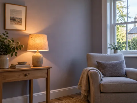
Warm evening lighting can intensify the colour's orange impression. If you mostly use the room at night, include that view early. A slightly greyer clay may give you the appearance you wanted from a brighter sample seen in daylight.
If the room already feels too orange, first remove the small warm accents temporarily. You may find the wall works well once a rust throw and copper-coloured accessories are no longer competing with it. Repainting is not always the smallest route to a calmer balance.
Finish with the adjacent wall and ceiling colours. A bright white edge makes the terracotta look sharper, while a softer off-white can create a gentler transition. The right boundary is the one that suits the room's existing light and materials, not a standard companion white chosen without testing.