A colour choice rather than a brightness choice
Warm white, cool white and daylight are descriptions of appearance, not promises about how a room will feel. The kelvin figure gives a more useful point of comparison than the name alone. Lower colour-temperature numbers generally look warmer; higher numbers look cooler. A bulb can be bright and warm, or relatively dim and cool.
For a sitting room used mainly in the evening, start by looking at the light you already enjoy. Record the specification of that bulb. It is a more relevant reference than a photograph of an unfamiliar room with different walls, camera settings and daylight conditions.
If you dislike the current arrangement, describe what bothers you. Does white paper look unusually yellow? Does a pale wall feel grey-blue? Is one corner noticeably different from the others? A clear description helps you change the right thing rather than replacing every lamp at once.
Test against the permanent materials
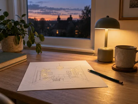
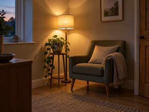
Bring together the materials that will remain in the room: flooring, sofa upholstery, curtains and wall colour. Look at them with the proposed lamp on after daylight has faded. Include a white object such as a plain sheet of paper so there is a familiar reference beside the coloured surfaces.
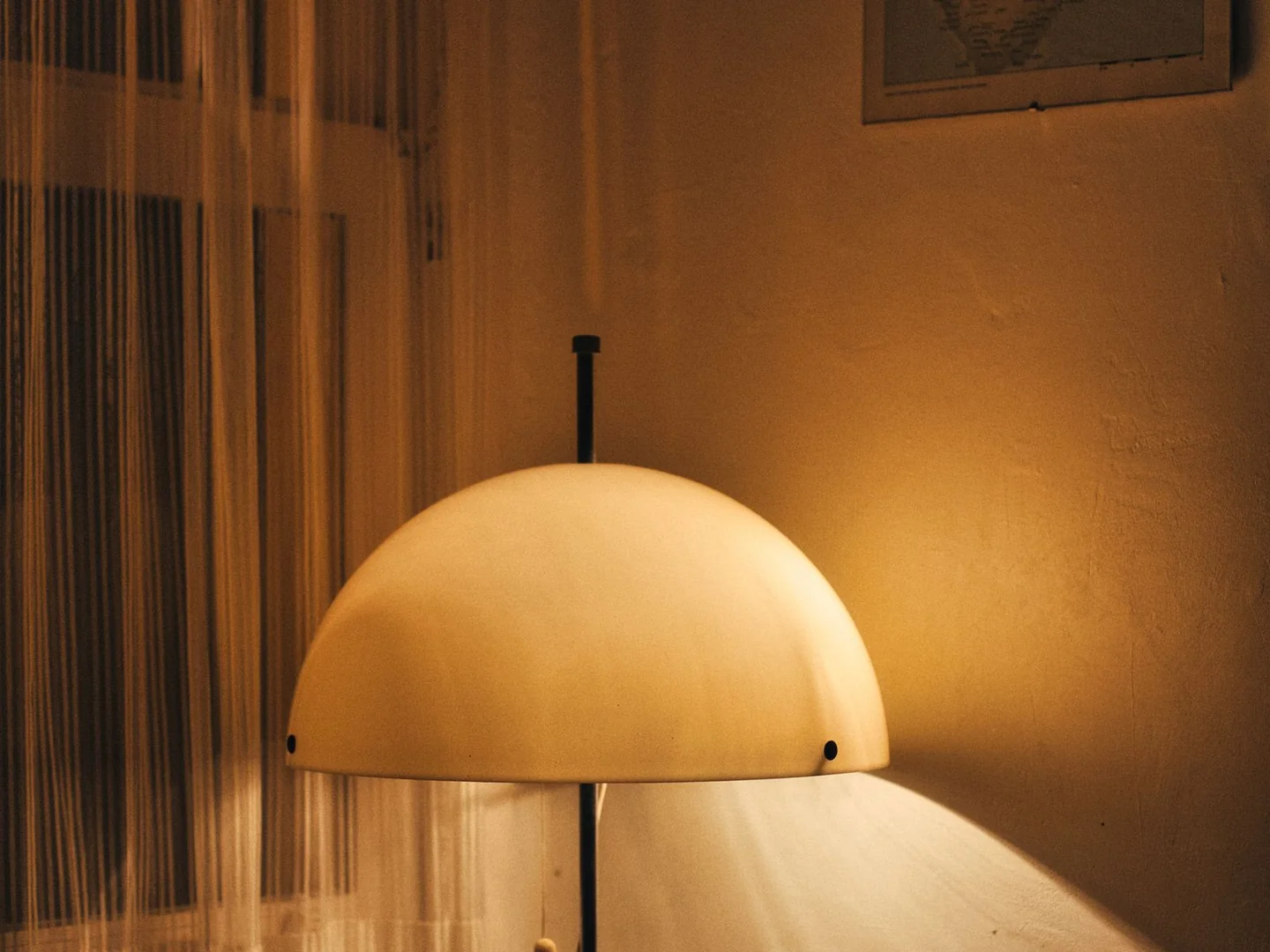
A cream lampshade can influence the light reaching the room. So can coloured glass. Comparing two bare bulbs on a shop shelf will not show the result once each is inside your chosen shade. Test the complete combination, particularly when a coloured shade is a large part of the design.
Where a lamp has adjustable white light, make changes slowly and settle on a setting for an ordinary evening. Rapidly cycling between extremes makes almost any middle setting look acceptable. Return to the room later and see whether the fabrics still look as you expected.
Keep adjacent spaces in the picture
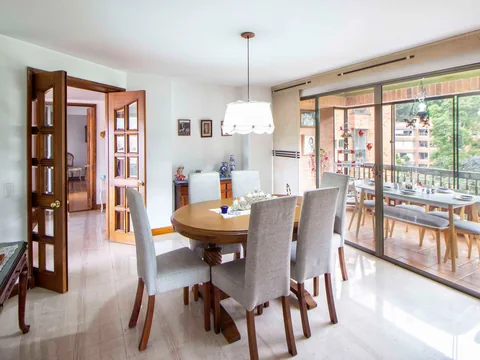
Look through the doorway into the next room. There is no need for every bulb in a home to match, but an abrupt change may be distracting if the spaces are always seen together. A kitchen and a sitting area can have different lighting needs while still avoiding an accidental patchwork of unrelated white tones.
Try switching off one lamp at a time when a room feels visually unsettled. The outlier may be a single replacement bulb rather than the whole scheme. Check its specification and its shade before changing anything else.
Choose the result you prefer for the activities in that space. Do not select a cooler lamp merely because a room is called a workspace, or a warmer one because a label calls it cosy. The useful decision happens when your notebook, curtains and favourite chair are all visible under the same light.